 02 / OUD SPRAY / Current direction
The home-fragrance chapter
A warm presence.
A quiet signature.
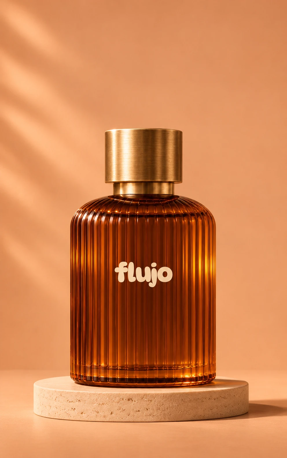
Amber glass. A fluted silhouette. Just the FLUJO wordmark, directly on the glass.
A closer lookCurrent visual direction. Product still in development.
Earlier bottle and carton explorations View the design archive
Earlier exploration / Retained design history
Earlier directions.
Part of the process.
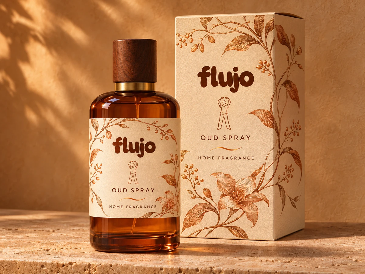
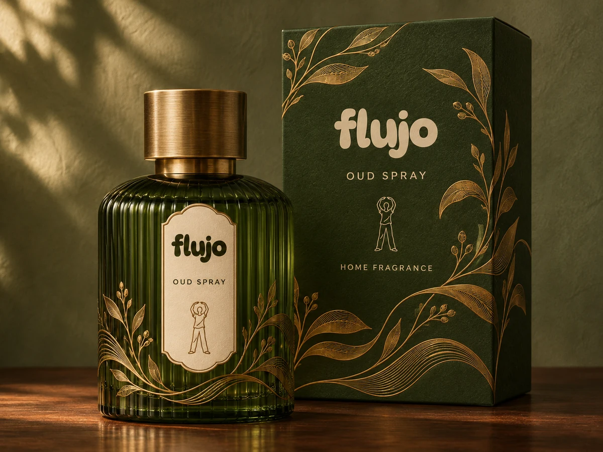
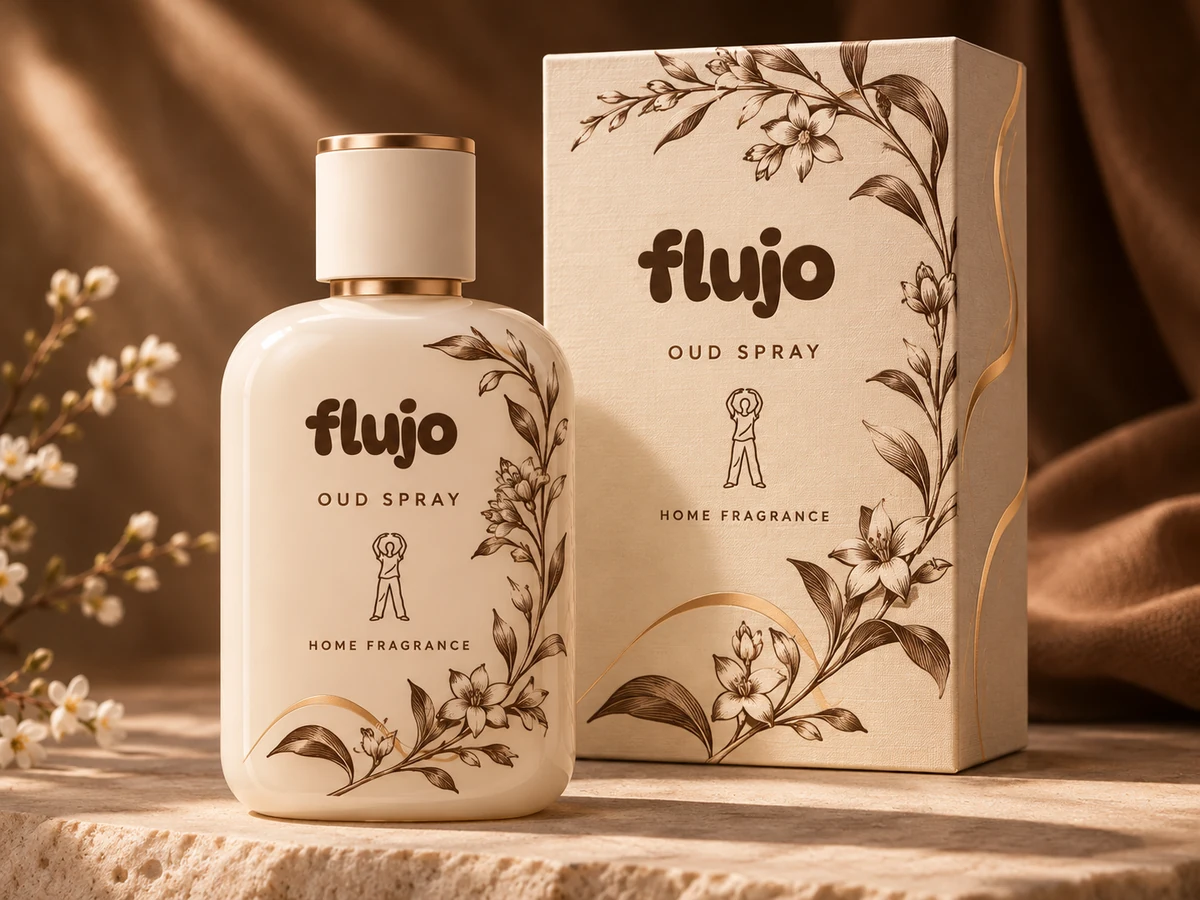
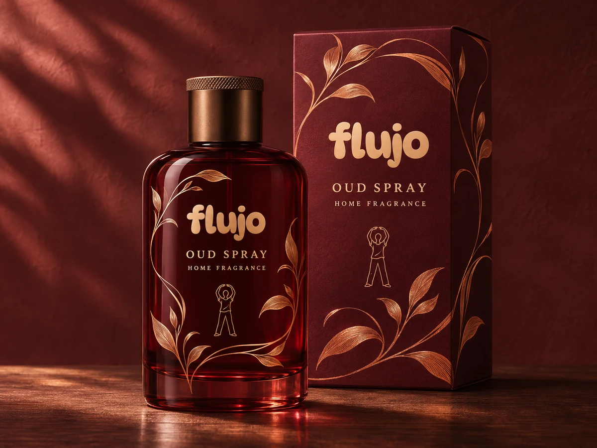
Four earlier decorative bottle-and-carton concepts, kept as a record of the design process. The current front direction above uses only the wordmark.
 View larger
Ember botanical
Cognac glass. Cream and copper botanicals.
 View larger
Moss tapestry
Ribbed forest green. Warm brass details.
 View larger
Ivory grove
Ivory, fine linework and champagne accents.
 View larger
Claret nocturne
Deep claret glass. Flowing bronze ornament.
These decorative bottle and carton explorations predate the current logo-only front. They are retained as design history; botanical artwork is decoration, not a fragrance ingredient statement.
Earlier bottle form View the archived 3D study
02 / OUD SPRAY / Earlier form study
An earlier form.
Kept in view.
This earlier cylindrical bottle has been superseded by the current logo-only front direction. Its surface model remains here as a record of the design process.
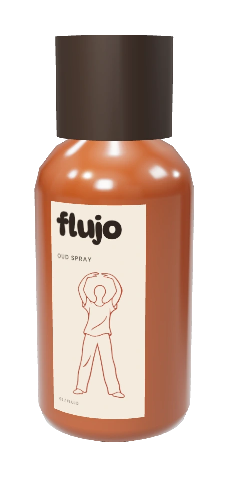
An earlier proportional surface study, retained as design history. Home fragrance is the chosen intended use; this model does not establish a pump mechanism, final dimensions, formula or pack compatibility.
A closer look / OUD SPRAY
For the rooms
you make your own.
The oud direction brings FLUJO into home fragrance. The current direction brings together amber fluted glass, a warm brass cap and an understated wordmark.
- The bottle direction
- Amber fluted glass with a warm brass cap. Final vessel and spray assembly remain open.
- The front
- Only the FLUJO wordmark printed directly on the glass. No paper label or decorative artwork.
- The next step
- Develop the fragrance, spray system, pack compatibility and clear home-fragrance directions.
Developed for the home. The formula, spray system, final label and use directions remain in development. This is a packaging exploration, not a finished product.
The design language
One family.
Individual character.
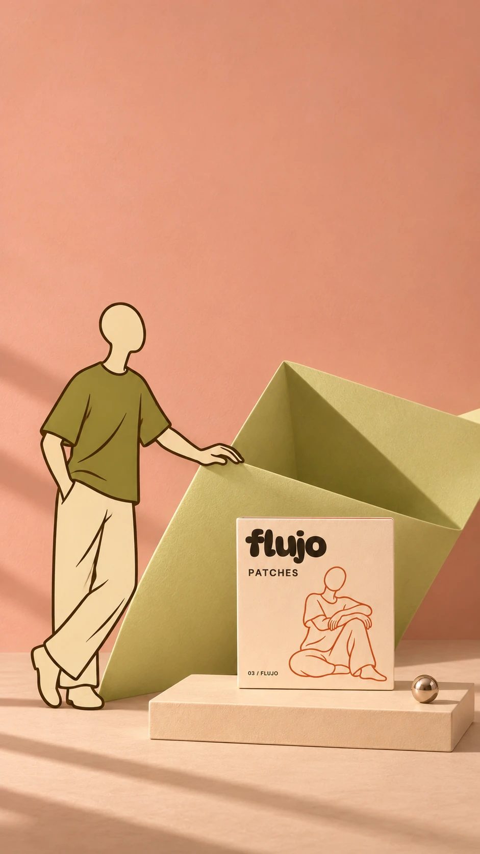
Chalk, espresso and terracotta. An organic wordmark. Human figures that change with the format, without losing the family resemblance.
The bottle keeps the front restrained. The broader Human world brings the warmth, colour and expressive figures.
Our point of viewNext in the collection